Component-Based Design
Component-Based Design is a method of building digital interfaces using reusable, self-contained building blocks, like buttons or navbars.
What exactly is component-based design in the context of Figma?
In Figma, component-based design is a methodology centred around creating a master version of any user interface element, which can then be reused across your entire project. Think of a simple button. Instead of designing a new button for every page, you create one master 'Button' component. This master component can have multiple variations, for example for different states like default, hover, and pressed, or for different styles like primary and secondary.
When you need a button, you simply use an 'instance' or a copy of that master component. The magic happens when you need to make a change. If you decide to update the button's colour or font size, you only need to edit the master component. Figma then automatically applies that change to every single instance of the button throughout your designs. This approach saves an enormous amount of time, reduces errors, and ensures your design remains perfectly consistent.
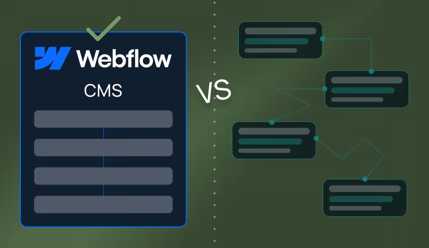
How does component-based design translate from Figma to Webflow?
The transition from a component-based Figma design to a Webflow site is remarkably seamless when done correctly. Webflow has its own powerful component feature that mirrors the concept in Figma. A well-structured Figma file, built with components, acts as a perfect blueprint for development. When we perform a Figma to Webflow handoff, we aren't just copying visual styles, we are recreating the same modular system.
We can build a 'Button' component in Webflow with the same properties and variants defined in Figma. This means that if you later decide to update the corner radius on all your site's buttons, we can make one change in the main Webflow component and it will update everywhere. This synergy between Figma and Webflow components is fundamental to creating websites that are not only visually accurate but also incredibly scalable and easy to manage long term.
What are the main benefits of using components for a website?
Adopting a component-based approach offers several powerful advantages for any digital product. Firstly, it provides unmatched scalability. As your website grows from five pages to fifty, you can be confident that your design language will remain consistent. A single update to a master component can ripple through the entire site, making large scale changes simple rather than scary.
Secondly, it guarantees brand consistency. Components act as a single source of truth for your visual identity, eliminating the risk of rogue elements or inconsistent styling appearing over time. This ensures every user has a cohesive experience with your brand.
Finally, it drives efficiency in both design and development. Designers can create complex layouts much faster by using pre-built, standardised blocks. For developers, it means writing cleaner, reusable code and being able to assemble pages and features with greater speed and reliability. This efficiency translates into faster turnarounds and a more robust final product.
Is a component library the same as a design system or UI kit?
While these terms are related and often used together, they represent different levels of a structured design process. Think of it as a hierarchy. A component is the smallest individual building block, like a button or an input field.
A UI Kit is a collection of these components. It's the tangible set of all the visual elements that will be used to build the interface. It includes all the buttons, forms, cards, and navigation elements, usually organised within a Figma file.
A Design System is the most comprehensive of the three. It encompasses the UI Kit and its components, but also includes the high level rules and principles that govern their use. A design system includes brand guidelines, a tone of voice, accessibility standards, and documentation on how and when to use each component. Component-based design is the underlying methodology that makes building and maintaining all of these assets possible.
How does Tahi Studio use component-based design for client projects?
At Tahi Studio, component-based design is not just a technique we use, it's fundamental to our philosophy of building lasting digital assets for our clients. Every project, especially those on our subscription, begins with the careful creation of a component library in Figma. This foundational step ensures we establish a scalable and consistent visual language from the very beginning.
This method allows us to build Webflow sites that are not only beautiful and functional upon launch but are also flexible and easy to maintain as your business evolves. For Glasswall, this component-based foundation was what made it possible to deliver both a structurally clean site and the demanding technical SEO and E-E-A-T work the project required, without one compromising the other. It empowers our clients with a system that can grow with them, preventing the need for costly rebuilds down the line. By building with components, we deliver a final product that is a true long term solution, embodying our commitment to quality and genuine partnership through our strategic approach.