Hero Section
The hero section is the first, prominent part of your website a visitor sees, designed to immediately capture their attention and state your core value.
What makes an effective hero section in modern web design?
An effective hero section is the digital equivalent of a perfect handshake. It's the first, prominent area a visitor sees on your website, often referred to as being 'above the fold'. Its primary job is to make a powerful first impression in just a few seconds. The most successful hero sections contain a few key ingredients: a compelling headline (your H1), a supportive sub-headline that adds context, engaging visuals like an image or video, and a crystal clear call-to-action (CTA) that tells the user what to do next.
Beyond these elements, the messaging is paramount. Your hero section must quickly answer three questions for your visitor: What do you offer? Who is it for? And why should they care? It's not about listing features. It's about communicating value and connecting with the user's needs or aspirations. It's the single most important piece of real estate on your website for setting the tone and guiding your visitor on their journey.
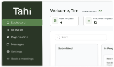
How do you design a high-converting hero section in Figma?
Designing a hero section in Figma is all about strategic planning before any development begins. It starts with establishing a clear visual hierarchy. Your main headline, which communicates your core value proposition, must grab the eye first. From there, your sub-headline and CTA should be visually distinct and logically placed. Figma is the perfect environment to experiment with different layouts, typography, and colour palettes to ensure every element aligns with your brand identity and serves a purpose.
We also use Figma's powerful prototyping features to bring the hero section to life. By creating interactive mockups, we can test how users will experience the design. This includes testing button hover states, entry animations, and the overall flow. This step allows us to refine the user experience and catch any potential issues early on, ensuring the final design is not just beautiful but also highly intuitive and effective at guiding users towards conversion through our proven prototyping process.
What are the best practices for building a responsive hero section in Webflow?
Translating a Figma design into a fully functional Webflow hero section requires a focus on flexibility and performance. Webflow excels at creating responsive layouts, and we leverage tools like flexbox and grid to ensure the hero section looks pixel-perfect on every device, from wide-screen monitors to mobile phones. This involves more than just shrinking elements. It means thoughtfully rearranging content so that the core message remains clear and the user experience is seamless, regardless of screen size.
Technical best practices are also crucial. For search engine optimisation and accessibility, the main headline in your hero section must be an H1 tag. We also ensure all images are optimised to load quickly and have descriptive alt text. Buttons and interactive elements are built with clean, semantic HTML. These details, all easily managed within Webflow, ensure your hero section is not just a pretty face but a robust, accessible, and high-performing asset for your business.
Can a hero section use video or Lottie animations effectively?
Absolutely. In fact, using motion can transform a static hero section into a dynamic and memorable brand experience. A well-executed background video can quickly show a product in action or evoke a specific emotion, capturing attention far more effectively than a static image. It helps tell a richer story in a shorter amount of time.
However, performance is a key consideration. Large video files can slow down your site, which is why Lottie animations are often a superior choice. Lottie files are small, vector-based animations that offer rich, complex motion without the heavy file size of a video or GIF. They are incredibly versatile and ensure your hero section remains fast and responsive while still providing a delightful and engaging visual experience for your visitors, supporting excellent page speed performance.
How can Tahi Studio help craft the perfect hero section for your brand?
A hero section is more than just the top of your homepage. It's the start of a crucial conversation between your brand and your customer. At Tahi Studio, we specialise in understanding your unique value proposition and translating it into a hero section that not only looks stunning but also performs flawlessly. We believe the best hero sections are built on a foundation of clear strategy, user-centric design, and technical excellence.
Our process takes you from strategic design in Figma to pixel-perfect development in Webflow. Using our flexible subscription model, we can work with you to build, test, and refine your hero section over time, ensuring your most valuable digital real estate is always optimised to welcome visitors and guide them towards becoming loyal customers through our collaborative approach.