Calm Technology
Calm technology is a design approach that creates digital experiences that respect user attention, reducing stress and making technology feel effortless.
What is calm technology and how does it apply to modern web design?
Calm technology is a design philosophy centred on creating interactions that don't constantly demand our attention. Think of it as the opposite of 'loud' technology, which bombards us with notifications, pop-ups, and alerts. Instead, calm technology operates quietly in the background, only coming to the forefront when it's necessary or when we choose to engage with it. The goal is to make technology a peaceful, integrated part of our lives, not a source of stress.
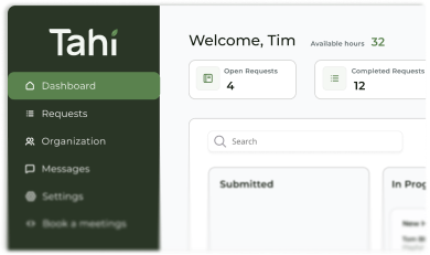
In modern web design, this principle is more important than ever. It translates into creating websites that are intuitive, unobtrusive, and respectful of the user's focus. A calm website guides visitors gently, rather than shouting for their attention. This means clear navigation, a logical flow of information, and interactions that feel natural and supportive. By reducing cognitive load, we create a more pleasant and effective user experience that builds trust from the very first click.
How can a calm UI design improve user trust and conversions on my website?
A calm User Interface (UI) has a direct impact on how users perceive your brand. When a website is cluttered, confusing, or aggressive with its marketing, it creates a sense of anxiety and distrust. Visitors might feel tricked into clicking on things or overwhelmed by too many choices. This friction is a major barrier to conversion. People are far less likely to purchase something, fill out a form, or trust your content if the experience feels stressful.
Conversely, a calm, well-structured design feels professional, confident, and user-centric. It communicates that you respect your visitor's time and intelligence. By making it easy for users to find what they need and complete their goals without hassle, you build confidence and credibility. This positive experience fosters trust, which is the foundation of any successful customer relationship and a key driver for conversion rate optimisation. We explore this concept further in our blog, The Calm UI: Designing for Trust, Not Tricks.
What are some examples of calm design principles to avoid overwhelming website visitors?
Implementing calm technology doesn't require a complete overhaul. It's often about making thoughtful, subtle choices that prioritise the user's peace of mind. Here are a few practical examples:
Strategic use of white space: Giving content room to breathe reduces visual clutter and helps users focus on what's important.
A clear visual hierarchy: Using size, colour, and placement to guide the user's eye naturally through the page, rather than having every element compete for attention.
Subtle and meaningful animations: Motion should provide feedback or guide the user, not just exist for decoration. A button that subtly changes colour on hover is calm; a banner that flashes aggressively is not.
Excellent page speed optimisation: A fast-loading website is inherently calmer than one that makes users wait. Performance is a core feature of a calm experience.
Unobtrusive notifications: Instead of jarring pop-ups that interrupt a user's flow, consider gentle banners or toast notifications that deliver information without demanding immediate action.
Is my current website design causing user anxiety or frustration?
It can be tough to see our own website from a fresh perspective, but there are common red flags that signal a stressful user experience. Ask yourself a few honest questions. Do visitors have to hunt for essential information like your contact details or pricing? Is your homepage cluttered with multiple, competing calls to action, leaving users unsure of what to do next?
Other signs of a 'loud' design include auto-playing videos with sound, intrusive pop-ups that are difficult to close, and navigation menus with confusing labels or too many options. High bounce rates or low time-on-page in your analytics can also be indicators that users are arriving, feeling overwhelmed, and leaving quickly. A calm website should feel like a helpful guide, not a confusing maze.
How can our team help create calm and user-friendly web experiences?
Tools like Webflow and Figma give us incredible power to design and build sophisticated websites, but technology is only one part of the equation. The real magic happens when these tools are used with a deep understanding of user-centric principles like calm technology. Webflow's ability to produce clean, efficient code leads to faster load times, while its advanced interaction engine allows us to create the kind of subtle, meaningful animations that enhance an experience without overwhelming it.
At Tahi Studio, we believe that a great website should bring clarity, not chaos. We use our expertise in both design and development to build digital experiences that are not only beautiful but also intuitive, respectful, and effective. We focus on building a solid information architecture and a clear visual language that guides your users effortlessly towards their goals. If you're ready to transform your website into a calm, trust-building asset for your business, start with our Free Site Audit to see how we can help.