Style Guide
A Style Guide is a foundational document that defines your brand's visual language, including colours, typography, logos, and spacing. It's the rulebook for your design.
What does drag-and-drop prioritisation mean for my project?
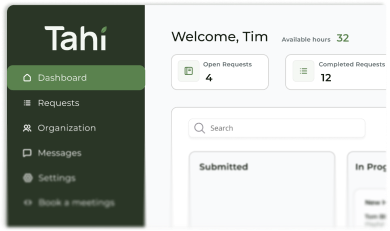
Drag-and-drop prioritisation is a beautifully simple feature that puts you in the driver's seat of your project's workflow. Instead of sending emails or waiting for a meeting to shift focus, you can visually reorder tasks in your dedicated client dashboard. The task you place at the top of your queue becomes the next priority for our team to tackle.
This method removes ambiguity and empowers you with direct control. It creates a transparent and agile environment where your most pressing needs are always addressed first. It's a dynamic task list that our team works through, ensuring we are always focused on what delivers the most value to your business right now.
How does a drag-and-drop task queue improve on traditional agency workflows?
Traditional agency workflows often involve project managers, status reports, and formal change requests to alter priorities. This can be slow and bureaucratic, creating delays and a frustrating disconnect between your needs and the agency's output. You might have an urgent request, but it has to wait for the next planning cycle or get lost in a long email chain.
Our drag-and-drop system cuts through all that. It's a core part of our productised service model and works seamlessly with our one active request at a time approach. By simply dragging a task to the top, you are directly signalling to our designers and developers what to begin as soon as the current task is complete. This eliminates bottlenecks and ensures the workflow truly reflects your business's immediate goals.
Can I change my priorities anytime with a drag-and-drop system?
Absolutely. That is the fundamental benefit of this system. Business needs can change in an instant. A new marketing opportunity might appear, or you might get sudden feedback that requires a new landing page. With drag-and-drop prioritisation, you can react immediately without any friction.
This level of flexibility is built into our ethos. You have the autonomy to reorganise your task queue 24/7, whether it's the middle of the day or late at night. Our team will see the updated priority list when they start their day and adjust their focus accordingly. It ensures your Webflow and design support is as agile and responsive as your business itself.
How does this system integrate with Figma designs and Webflow development?
The system creates a seamless and visible journey from idea to live implementation. You can stack your task queue with every step of a project, and then order them logically. For example, your queue might have 'Design new services page in Figma' as the top priority. Once our design team completes and gets your approval on that task, it's marked as done.
You can then drag the next logical task, 'Develop new services page in Webflow', to the top of the queue. This clarity ensures there are no crossed wires. The entire lifecycle of a feature, from a Figma prototype to a fully developed Webflow page, is managed and prioritised by you within a single, unified system through our proven handoff process.
How can my business gain control with a smarter task management system?
Gaining genuine control over your digital projects is about more than just seeing progress. It's about being able to direct that progress easily and effectively. A system built around drag-and-drop prioritisation is designed to remove friction and put the strategic power back in your hands, where it belongs.
At Tahi Studio, our entire subscription model is built on this principle of transparent partnership and client empowerment. Our client dashboard gives you a clear view of your task queue and the power to change it instantly. It's how we make working with a high-quality, expert Webflow agency feel simple, responsive, and truly collaborative.