Above the Fold
The part of a webpage visible without scrolling. Getting this area right is key to grabbing attention and encouraging users to explore further.
What does 'above the fold' mean in modern web design?
The term 'above the fold' originally comes from the world of newspapers. It referred to the top half of the front page that was visible when the paper was folded. This was prime real estate reserved for the most important headlines and images to entice people to buy and read the full story.
In web design, the concept is the same. It is the portion of your website that a visitor sees on their screen immediately upon arrival, without any scrolling. However, unlike a newspaper, the 'fold' is not a fixed line. It changes depending on the user's device, screen size, and resolution. What is visible on a large desktop monitor is very different from what is seen on a smartphone. So, today, we think of it less as a rigid measurement and more as the critical first impression your website makes.
How does above the fold content impact my website's conversion rate?
The content above the fold has a huge impact on your website's performance because it is your first and best chance to engage a visitor. People make snap judgements. If the initial view of your site is confusing, uninteresting, or does not immediately communicate what you do, they are likely to leave. This is known as a 'bounce'.
A well designed above the fold section, often called the Hero Section, grabs attention, clearly states your value proposition, and guides the user toward a specific action. By presenting a clear path forward with a compelling Call to Action (CTA), you significantly increase the chances of a visitor staying, exploring, and ultimately converting into a customer. It sets the tone for their entire experience on your site.
What essential elements should I include above the fold on my homepage?
To make the most of this valuable space, you need to be strategic and concise. Your goal is to answer three questions for the visitor almost instantly. Who are you? What do you do? And what can I do here? Packing this area with too much information can be as bad as providing too little.
Here are the core elements for a successful above the fold section:
- A Clear Headline: Your main value proposition in a few powerful words.
- A Supporting Subheading: A brief sentence that expands on the headline, providing a little more detail.
- A Primary Call to Action (CTA): A clear, unmissable button that tells users what the next step is, like 'Book a Call' or 'See Our Work'.
- Engaging Visuals: High quality imagery, video, or subtle animations that support your brand and message without slowing down the page.
- Simple Navigation: An intuitive menu that allows users to easily find what they are looking for.
Is 'above the fold' still important for mobile and responsive websites?
Yes, it is arguably more important than ever. While it is true that users are more accustomed to scrolling on mobile devices, the screen space is far more limited. This means every pixel counts. The first screen's worth of content must work even harder to capture attention and convince the user that scrolling down is worth their time.
Effective Responsive Design is not just about making things fit on a smaller screen. It is about prioritising content. For mobile, this often means focusing on a single, powerful headline and a very clear call to action above the fold. Ensuring a seamless and intuitive User Experience (UX) from the very first glance is critical for keeping mobile users engaged.
How can we design a compelling above the fold experience in Webflow?
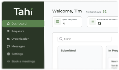
Designing a powerful above the fold section is a blend of art and science. It is about creating a visual and emotional connection while guiding users towards a business goal. At Tahi Studio, we start by understanding your strategy and your audience before a single pixel is placed in Figma. This ensures the design is not just beautiful, but purposeful.
Using Webflow, we bring that strategy to life with pixel perfect execution. We focus on creating lightweight, fast loading hero sections that look stunning on every device. We believe in quality Webflow development that combines a seamless Figma to Webflow handoff with clean code and a focus on performance. This ensures your first impression is not just visually engaging but also technically sound.
If you are looking to create an 'above the fold' experience that captures attention and drives results, we are here to guide you. Get in touch to see how we can build something great together.