Visual Hierarchy
Visual hierarchy is the art of arranging website elements to guide a user's eye, showing what's most important and what to do next.
What does visual hierarchy actually mean in website design?
Think of visual hierarchy as the visual language your website uses to communicate importance. It’s the practice of arranging elements on a page in a way that tells visitors what to look at first, second, and third. Just like a newspaper uses a big headline to grab your attention, a website uses visual cues like size, colour, contrast, and spacing to guide the user's focus through the content in a deliberate and intuitive way.
A strong visual hierarchy turns a cluttered page into a clear story. It’s not just about making a site look pretty; it’s a fundamental part of effective User Experience (UX) and User Interface (UI) design. When done right, users can scan your site and instantly understand what your business does, what they can do next, and where to find the information they need without having to think too hard.
Why is visual hierarchy important for guiding users on my Webflow website?
On a Webflow website, visual hierarchy is the key to turning casual visitors into engaged customers. It creates a clear path for them to follow, leading them naturally towards your most important goals. Whether you want someone to sign up for a trial, read a case study, or make a purchase, a well-planned hierarchy makes that primary Call to Action (CTA) impossible to miss.
Without a clear hierarchy, users land on a page and are faced with a wall of information. They don't know where to start, feel overwhelmed, and are more likely to leave. By establishing a clear order of importance, you reduce this cognitive load, making the experience feel effortless and calm. In Webflow, this is especially powerful because you can build these hierarchical rules into your components and styles, ensuring a consistent and user-friendly experience across your entire site.
What are the key principles for creating effective visual hierarchy in Figma?
Before any code is written in Webflow, a strong visual hierarchy is born in Figma. Designers use several key principles to establish this order and guide the user's eye. Mastering these in the design phase ensures a seamless Figma to Webflow handoff.
The most common principles include:
- Size and Scale: Larger elements feel more important. We use this for headlines, key images, and primary buttons to make them stand out.
- Colour and Contrast: A bright, high-contrast button will always draw more attention than a muted, low-contrast one. We use colour strategically to highlight interactive elements and key information.
- Typography: A well-defined typographic scale with distinct headings, subheadings, and body text is crucial. Using different font weights and sizes creates a clear reading order. This is a core part of any solid Design System.
- Whitespace: The empty space around elements is just as important as the elements themselves. Ample whitespace gives content room to breathe and draws focus to what matters most.
- Proximity: Grouping related items together visually signals that they belong together. In Figma, tools like Auto Layout help create these logical groupings effortlessly.
Can you show examples of good and bad visual hierarchy on real websites?
Absolutely. You can spot the difference easily once you know what to look for.
A website with good visual hierarchy feels intuitive and easy to navigate. Think of a successful SaaS Landing Page. You'll likely see a large, compelling headline in the Hero Section that grabs your attention. Below it, a slightly smaller sub-headline explains the value proposition. Your eye is then drawn to a bright, prominent 'Sign Up' button. As you scroll, clear headings break up content into logical sections, using icons and images to support the text. The user journey feels guided and logical.
Conversely, a site with poor visual hierarchy feels chaotic and confusing. Imagine a homepage where three different headlines are the same size, fighting for your attention. The contact button, the 'learn more' link, and the 'buy now' button are all the same colour and weight, giving you no clue as to which is the most important. Sections are crammed together with little whitespace, making it hard to distinguish where one topic ends and another begins. This often leads to frustration and a high bounce rate, as users simply give up trying to find what they need.
How can a better visual hierarchy improve my website's conversions?
A strong visual hierarchy has a direct and measurable impact on your website's performance. By creating a clear visual path, you guide users directly towards your most important conversion points, whether that’s a contact form, a checkout page, or a demo request. It removes friction and uncertainty from the user journey, making it easy and obvious for them to take the next step.
This is the essence of effective Conversion Rate Optimisation (CRO). You are not trying to trick users; you are simply making the desired action the easiest and most logical choice. Nailing your visual hierarchy isn't just about making things look good; it's a strategic process that blends design psychology with your business goals.
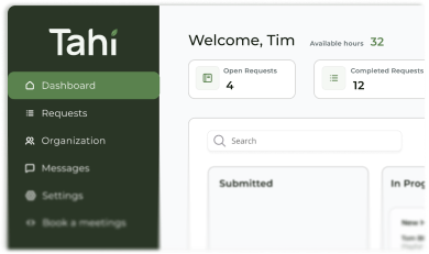
At Tahi Studio, we build this strategic thinking into every Figma design and Webflow build. We create clear, intuitive websites that guide your users and drive results. If you feel your current website is confusing visitors instead of converting them, it might be time for a fresh perspective. You can start with our Free Site Audit to get actionable insights, or if you're ready to build something solid from the ground up, book a call with us today.